iPhone OS 3

While self confessed geeks and technology enthusiasts like myself may get 2 or 3 years out of a device (if that, I know many people who switch phone multiple times a year), normal people expect to get a bit more out of these expensive gadgets. I found a first gen iPod Touch in my dad’s glove box today and thought I’d reminisce about how much iOS (then called iPhone OS) had changed, yet in some ways hasn’t much at all.

Home screen

2014-07-13 19.34.03

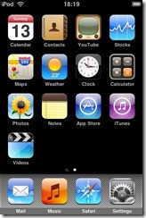
This was how it looked from iPhone OS 1 through to 3 – the metallic dock. The iPod Touch always had separate ‘Music’ and ‘Video’ apps, whereas iPhones has a single app called  ‘iPod’. No wallpaper, but apart from that it stayed pretty much the same until iOS 7 moved Spotlight search to the top instead of being on the left.

Lock Screen

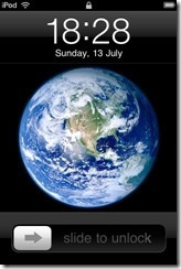
2014-07-13 19.33.46-1

The lock screen stayed exactly the same until iOS 7 – the only minor change was the additional of a camera button in iOS 5.1.

Home button

2014-07-13 19.33.54-3

2014-07-13 19.33.45

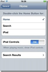
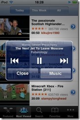
The days before ‘multitasking’ (aka recent task switching) meant the home button ‘double tap’ action could be customised. I always remember having it be set to launch the music player. If you had ‘Show iPod Controls’ selected then you would get an alert box with music controls, no matter which app you were in. Multitasking.

iTunes Store

2014-07-13 19.33.54-2

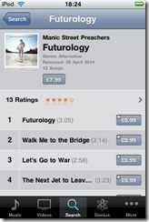
The iTunes Store was a major selling point of the iPod Touch. Being able to wirelessly buy and play an album within minutes was pretty darn mind blowing at the time.

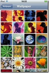
Wallpaper

2014-07-13 19.34.04-2

The bundled lock screen images seem very ‘of their time’ – silhouettes with white ear buds.  

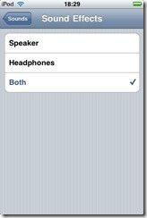
No Speaker

2014-07-13 19.33.46-2

This setting is a carry over from the classic iPod. The original iPod Touch had no loudspeaker. The noises it could make were on par with a Casio watch.

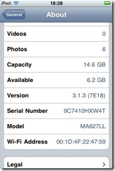
About

2014-07-13 19.33.47-2

Released in 2007, the iPod Touch got its last software update on February 2nd 2010.
WWDC 2014 Opening Keynote Thoughts

Overall a packed keynote with lots to say, here are my highlights.


  • iCloud Drive is looking to take on Dropbox and SkyDrive, with Windows clients too.
  • CloudKit looks to be something similar to Microsoft’s Windows Azure Mobile Services, but free. Will it support non-iOS clients, though?
  • HealthKit and HomeKit look interesting, as long as they don’t go the same way as Game Center.
  • Finally, we have unified communications between all your devices. Receive SMS on your PC, make phone calls from an iPad. Great stuff.
  • With widgets in the sidebar and lots of translucency, I couldn’t help but think of Windows Vista when I saw Mac OS X 10.10. I joke of course, though I will miss the 3D dock.
  • The new Spotlight service looks like it will be extremely useful, and could reduce iOS/Mac OS users’ reliance on Google.
  • The new photos in the cloud service should really help me with my measly 16GB device. Can’t wait for the Mac version to be released.
  • Objective-C replaced! I was not expecting that. Great to see a more modern language being introduced.

iOS Disappearing Calendar Notifications – Mystery Solved

Ever turned in your iPhone to see a calendar notices suddenly disappear from the lock screen? I've been seeing this a lot lately, and it's really bugged me – especially when my phone is on silent (as it is most of the day), so I can check it at chosen intervals rather than be disturbed (developer thing, no doubt) .

Well it turns out iOS will remove a notification after the event has finished. Kind of makes sense, although it does mean if you totally miss an appointment, you'd be none the wiser unless you pay very careful attention and see it before the notification quickly disappears.

Odd quirk, but probably not a bug – just a design choice (I would say it makes sense to remove them from the notification centre, perhaps not the lock screen) and Apple should probably hide it before the screen turns in to avoid the confusion of seeing something for a split second.