Apple just gave me a new smartwatch, for free

Well, not quite, but the latest update from Apple might as well be a new watch. The new operating system, watchOS 3 is one of the best operating system updates I’ve ever seen in the 18 years or so since I’ve been interested technology.

There was a time when a new OS update meant inevitable slowness until you finally succumbed to the marketing and upgraded by either stuffing more RAM into your PC, or shelling our for a brand new machine. This changed in the PC world with Windows 7, which famously had the same operating requirements as it’s then 2 year old predecessor, Windows Vista. Apple hasn’t always been so kind, with new versions of iOS regularly slowing down older hardware, though this hasn’t been so much of a problem since the 64-bit era (2013 iPhone 5S or newer), but even now an iPhone 6 doesn’t feel as snappy as it did 3 years ago.  So it was a nice surprise when Apple announced back in June that its latest incarnation of the operating system for the Apple Watch, watchOS would be focused on performance. This was long overdue. Apple Watch’s main failure was it’s slowness. Unlike a laptop or a phone, a slow smartwatch can be physically painful to use. So for the most part people didn’t it seemed – 3rd party apps were few and far between.

The new version of watchOS achieves this speediness by keeping apps in memory for as long as it can. You now get to choose your 10 favourite apps and place them in a ‘dock’, and they’ll be prioritised over other apps to not only stay in memory but also receive more frequent background updates. Frequent background updates also apply to ‘complications’ (widgets on the watch face). What is striking though is the amount of fit and finish that’s been applied to the system. Now apps do really launch instantly, for the most part. If like me you only use 4 -5 apps of a regular basis, then it’s likely those apps will always be in memory. This results in a much more usable device.

Siri, the voice controlled virtual assistant is now much more efficient at communicating its status as when you ask for something. Instead of having to watch your wrist to see if it managed to understand what you said, you can now drop your wrist and it will subtle tap you when it has your answer, or to tell you if it didn’t understand. A small change, but it makes a big difference to the usefulness of the feature.

You can now draw characters onto the screen to transcribe text. It takes a bit of getting used to, but it’s a nice way to quickly reply when your phone is out of reach. Reminders are now available on the watch, and stay on the screen for up to 8 minutes after you last used the app, so I can walk round the supermarket checking off my shopping list on my wrist. The watch now feels more useful then it did before, when I was only really using it for notifications and fitness tracking (which are still first class).

On my smaller 38mm machine battery life still isn’t great. It seems to be slightly worse than before. Where I would have previously been at 25% at the end of the day, I’m now at 10%. This may well be because I’m using it a lot more now. I’ve long been in the habit of a post-lunch charge at my desk, so it’s not an issue most of the time.

I’ve always been compelled by the idea of having a computer strapped to my wrist, accessible at any time. This ‘ambient computing’ experience is finally realised with watchOS 3. What is really needed now is a watch with it’s own cellular modem, so the phone truly becomes an optional extra.
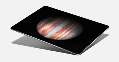
Better software, not a bigger screen, is what the iPad needs

The iPad Pro


The iPad Pro is now available, with its much larger screen. Admittedly I haven't had a chance to try one yet, and having only purchased a new iPad last year, I probably wouldn't consider such a purchase so soon anyway. But as someone who does try and do real work on an iPad, (I enjoy stepping away from my desk from time to time to focus in on something, and the iPad is perfect for this.), I am not frustrated by the iPad's lack of screen real estate (though I've no doubt more is better, it usually is) but by its limited software.

This 'limited software' is not always the fault of Apple, developers purposely try and simplify their iPad releases in an effort to route out the bloat that dogs their desktop equivalents. This is mostly a good thing, as someone who runs complex software projects for a living, I am always a proponent of the KISS philosophy (Keep It Simple, Stupid). However, there haven been numerous times when I've had to walk back to my desk and grab my laptop because something just isn't possible on an iPad.

Take Microsoft Excel. The desktop version may be a horrible, bloated and full of legacy code (it seems to have its own rules on when to wipe your clipboard unexpectedly), but to its credit, it does make a lot of complex, routine tasks very quick and easy. If I have a list of stuff and I want to remove duplicates, it's one click. If I have a CSV file (or values separated by another delimiter), converting this to columns is only 2 or 3 clicks. None of this functionality exists in the iPad version. Microsoft OneNote on the iPad doesn't have Outlook integration (the ability to pull in meeting details), and while Microsoft have recently added support for audio recording to OneNote, it's modal – meaning I can't take notes while I am recording – which is one of my favourite features of the desktop version, because it synchronises your note with the timestamp of the audio recording, meaning you can quickly seek to important parts of a meeting when you're trying to remember what was going on. Again, back to my laptop.

I don't want to pick on Microsoft, they make some of the highest quality iPad software out there, and I know all too well that quality, time to market and the number of features are all opposing interests, and Microsoft has made the decision to go for quality over features. There's nothing wrong with that, in fact it's the best decision they could have made in my view, but it doesn't change the fact that the iPad just can't do these seemingly simple things a laptop can. Adobe and Apple both have examples too. I was sent a wireframe that had been hand-drawn and had been scanned and emailed directly from a networked printer/scanner. I wanted to annotate the resulting PDF. On the Mac I would use Preview, on Windows I'd use Adobe's Reader application. Preview on iOS doesn't support annotation, so I used the Adobe Reader app for iOS. It did support annotation, but due to the way the image had been scanned in, it was upside down. Surprisingly, there was no way to rotate the PDF. Back to my laptop, again. Yes with a little help from Google, I'm sure I could find an app that lets me rotate a PDF, but will it also support all the other things the Adobe app does? The bottom line is, it's not feasible to go on an app hunt every time one of the simplified versions of an app comes up short. When Steve Jobs introduced the iPhone in 2007 he made a big deal out of the fact other smartphones only showed you the 'baby web' and the iPhone didn't – we have the same situation on iOS now, we get baby applications.

Then there is the inability to have more than one document open at once. I can now have Twitter and Pages open at the same time, but not two Pages documents. Even just a way to quickly switch between documents would be nice. At the moment I have to close the first document, find the other one (navigate a long list of files and folders), load it (and wait while it loads), and then repeat the process when I want to return to the original document. Writing one document when referring to another is not an uncommon computing task, and yes there are workarounds like exporting one of them as a PDF and opening it in a separate application, but this isn't very clean, and what if I want to edit both documents?

I don't want to take way from the iPad what is is great at; web browsing, writing this blog post, simple spreadsheets, reading books, playing games, managing email, task lists – the list goes on. While I'm sure the iPad Pro is a beautiful device, and if money was no object Id buy one today, I don't think having a bigger screen is going to turn it into a laptop replacement. I would love to be able to work solely on an iPad, but until the software improves, I can't see this happening, no matter how big the screen is.


Apple Watch Battery Saving Tips

If you have the smaller version of the Apple Watch, then you may find the battery just about gets you through the day. Over the past 6 weeks of using it I've been experimenting with the various settings to find the best way to save battery life.

Note: Like with battery saving tips for phones, these tips will reduce functionality, so they're not meant for daily use. Apple Watch has a built in power save mode, but with that switched on the watch is less useful than a £10 Casio watch (at least you don't have to press a button to see the screen on one of those!). These tips are meant for those long days or weekends where you want to keep the watch going for as long as possible, while maintaining the fitness tracking and ability to receive notifications (these things are not possible in Power Save mode).

Turn off Wrist Raise

On the watch itself, under Settings > General you can turn off Wrist Raise. This makes the watch a lot less useful because you will have to press a button to see the screen, but if you are out and about on a weekend and don't particularly care about the time, but want to make sure your fitness progress still gets tracked, it's a great way to save significant battery life.

Use the X-Large watch face

If you can do without seeing the weather or other useful widgets on your watch face, the X-Large's use of lots of black and no widgets means it uses far less battery juice, in my experience at least.

Use Power Saving Mode for workouts

In the Apple Watch app on your phone, choose the settings for the 'Workout' app, and select power saving mode. This stops the watch from continuously reading your pulse during workouts – very useful if you're doing long runs or walks, as the heart rate monitor sucks battery life. It will mean however, that your calorie burn stats wont be as accurate.

Turn on Airplane Mode

This one is only slightly better than Power Save mode. You'll still be able to track your activity, receive stand notifications or notifications for appointments already synced to your watch – obviously you wont get any alerts that come from your phone (such as messages). If you're away camping for the weekend, maybe that's OK?

Stay near your phone

I've noticed the battery life is a lot worse when I spend a lot of time away from my desk at work, but leave my phone at my desk. This makes sense – when the phone is within Bluetooth range, the watch will use this connection for things like alerts. When you move away from your phone, it instead has to connect to Wi-Fi directly. Wi-Fi is much less power efficient than Bluetooth.