Better software, not a bigger screen, is what the iPad needs

The iPad Pro


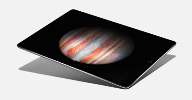
The iPad Pro is now available, with its much larger screen. Admittedly I haven't had a chance to try one yet, and having only purchased a new iPad last year, I probably wouldn't consider such a purchase so soon anyway. But as someone who does try and do real work on an iPad, (I enjoy stepping away from my desk from time to time to focus in on something, and the iPad is perfect for this.), I am not frustrated by the iPad's lack of screen real estate (though I've no doubt more is better, it usually is) but by its limited software.

This 'limited software' is not always the fault of Apple, developers purposely try and simplify their iPad releases in an effort to route out the bloat that dogs their desktop equivalents. This is mostly a good thing, as someone who runs complex software projects for a living, I am always a proponent of the KISS philosophy (Keep It Simple, Stupid). However, there haven been numerous times when I've had to walk back to my desk and grab my laptop because something just isn't possible on an iPad.

Take Microsoft Excel. The desktop version may be a horrible, bloated and full of legacy code (it seems to have its own rules on when to wipe your clipboard unexpectedly), but to its credit, it does make a lot of complex, routine tasks very quick and easy. If I have a list of stuff and I want to remove duplicates, it's one click. If I have a CSV file (or values separated by another delimiter), converting this to columns is only 2 or 3 clicks. None of this functionality exists in the iPad version. Microsoft OneNote on the iPad doesn't have Outlook integration (the ability to pull in meeting details), and while Microsoft have recently added support for audio recording to OneNote, it's modal – meaning I can't take notes while I am recording – which is one of my favourite features of the desktop version, because it synchronises your note with the timestamp of the audio recording, meaning you can quickly seek to important parts of a meeting when you're trying to remember what was going on. Again, back to my laptop.

I don't want to pick on Microsoft, they make some of the highest quality iPad software out there, and I know all too well that quality, time to market and the number of features are all opposing interests, and Microsoft has made the decision to go for quality over features. There's nothing wrong with that, in fact it's the best decision they could have made in my view, but it doesn't change the fact that the iPad just can't do these seemingly simple things a laptop can. Adobe and Apple both have examples too. I was sent a wireframe that had been hand-drawn and had been scanned and emailed directly from a networked printer/scanner. I wanted to annotate the resulting PDF. On the Mac I would use Preview, on Windows I'd use Adobe's Reader application. Preview on iOS doesn't support annotation, so I used the Adobe Reader app for iOS. It did support annotation, but due to the way the image had been scanned in, it was upside down. Surprisingly, there was no way to rotate the PDF. Back to my laptop, again. Yes with a little help from Google, I'm sure I could find an app that lets me rotate a PDF, but will it also support all the other things the Adobe app does? The bottom line is, it's not feasible to go on an app hunt every time one of the simplified versions of an app comes up short. When Steve Jobs introduced the iPhone in 2007 he made a big deal out of the fact other smartphones only showed you the 'baby web' and the iPhone didn't – we have the same situation on iOS now, we get baby applications.

Then there is the inability to have more than one document open at once. I can now have Twitter and Pages open at the same time, but not two Pages documents. Even just a way to quickly switch between documents would be nice. At the moment I have to close the first document, find the other one (navigate a long list of files and folders), load it (and wait while it loads), and then repeat the process when I want to return to the original document. Writing one document when referring to another is not an uncommon computing task, and yes there are workarounds like exporting one of them as a PDF and opening it in a separate application, but this isn't very clean, and what if I want to edit both documents?

I don't want to take way from the iPad what is is great at; web browsing, writing this blog post, simple spreadsheets, reading books, playing games, managing email, task lists – the list goes on. While I'm sure the iPad Pro is a beautiful device, and if money was no object Id buy one today, I don't think having a bigger screen is going to turn it into a laptop replacement. I would love to be able to work solely on an iPad, but until the software improves, I can't see this happening, no matter how big the screen is.
 

Outlook for iPad

Last month Microsoft released Outlook for iPad (based on Acompli, an app it has previously purchased). Since the company I work for uses Exchange 2013, I was able to take advantage of this and try it out. The interface is a breath of fresh air for anyone, like me who is stuck using Outlook 2013’s confusing and dated interface. My favourite feature is the ‘Focused’ inbox with automatically shows you a view of messages deemed important. Newsletters, alerts and other noise are quietly hidden away so you only get to see emails from real people. The ‘other’ inbox is only a swipe away, and the focused view is only that, a view; so it won’t have any effect on your desktop email view. This is surprisingly accurate and didn’t require much training. Replying and managing email is pleasant, with the ability to swipe to archive or flag email quickly.

Outside of the corporate word, the app supports Outlook.com, Gmail and other well-known email providers. I like to keep work and personal email separate, so I haven’t tried these.


Attachments

Another surprising feature of Outlook for iPad is the ability to connect to cloud services such as Dropbox and Google Drive 1. A lot of network administrators will loose sleep over this, but ultimately it’s a step forward – especially for users of Office 365 who will be able to access all of their ‘OneDrive for Business’ files and attach them to emails wherever they happen to be.

A week point however is the lack of a system extension, so it’s not possible to share a link from Safari to Outlook, or send and document directly from Word for iPad. I’m sure this is on the way, but I do think it should have been included in the initial version.


Calendar

The calendar seems quite basic. It doesn’t seem to do a great job of letting me see other invitees ‘free/busy’ information (the main benefit of using the desktop version of Outlook), but it’s serviceable for a version 1.0 release. It’s quite buggy, for example, I tried to update an appointment start and end date, but it just didn’t work. No crash, no error message, it just didn’t do anything. I’m sure Microsoft’s latest purchase, Sunrise indicates Microsoft is putting some thought into its calendaring strategy, and so major improvements should be on the way. I’m not sure about the unified app approach – I’ve always wished Outlook on the PC were separate applications instead of one big conglomerate (especially since it’s still full of model dialog boxes! I digress…) – separate apps seems especially fitting for iOS, and I can only think it’s a branding decision to go with one big ‘Outlook’ app on iOS.


Security Concerns?

The first release had no security requirements at all, so if your system administrator had mandated users have a passcode on their device, Outlook would ignore it. This has been resolved, though unfortunately it requires you set a PIN at a system level on the device, rather than just for the app (as had been the case with the pervious OWA app). I liked the fact I could have more lax security on my personal device (e.g. ‘Ask me for a PIN after 1 hour’) while the app could be much more strict (‘ask me for a pin after 5 minutes’) – this worked in the old OWA app, but not anymore; which is a major disappointment. Some system administrators might lament the fact the then app will store your emails on Amazon’s AWS servers (soon to be Azure, I have to believe), but it does allow the app to do lots of cloud processing that ultimately benefits users. The fact that Microsoft just released the app without any warning and a way to block the app is probably the bigger concern in my views, as I can understand organisations who have various security practises (ISO et al) not being very happy about being caught off-guard like this.


Conclusion

Overall, Outlook for iPad solidifies the iPad as a tool for business and makes me think that one day, many users will be able to use an iPad (or similar device) exclusively at work.

It’s missing some key features at the moment (you can’t set your ‘Out of Office’), but I’m certain they will come in time. The bigger question is whether tablet-devices will ever replace traditional PCs in the workplace. This is probably the subject of a future blog post, but with Outlook, Office and the cloud it’s becoming an increasing possibility. I personally use Outlook for iPad as more of a sidekick device than a laptop replacement, but then my job does involve using a lot of traditional desktop software such as Visual Studio, or macro-enabled spreadsheets. That said, for many enterprise users, an iPad with a decent hardware keyboard is now a viable alternative, if not for the small screen size.


1. Great to see Microsoft embracing interoperability, in contrast to Google, who refuse to support Windows Phone.

Xbox One – Initial Thoughts

I was lucky enough to be bought an Xbox One for Christmas, so I thought I’d post some of my initial thoughts.

The games look amazing

I have one game (Forza 5) and at £50 a pop I will likely only have one game for many months to come. That said, together with the new controller that has vibration motors in each trigger (lets you feel feedback from the brakes), speeding around Circuit de la Sarthe has never felt so real. Whether it’s being blinded temporarily by the sun, or seeing a glimpse of the driver in the windscreen, it just feels so real.

The Interface is Confusing

While I wanted to love ‘Metro’ on the PC, after trying it for just over a month on my main development machine, I had to revert to using Start8 – it didn’t work out for me (loved it on the Surface RT, however) – so how does it stack up on the Xbox One? My view is that it could work, but the current execution isn’t great. On the main screen the positions of apps move about too often, so it’s impossible to remember where anything is. After a while I realised the tiles on the main screen amounted to a ‘recently used list’ the with exception of the left and right columns, which are fixed. There’s no visual differentiation, barley any visual hierarchy (the currently running app is the largest, everything else just looks like it was thrown in) and so it all gets rather confusing. To get to Settings for example, you have to go to ‘My Games & Apps’.

Apps for the sake of Apps

No device these days would be complete without an ‘App Store’ – however the Xbox One has taken this to extremes. For example, if you’re in a game and you get an achievement, in order to see the full details of that achievement you need to leave the current game and open another app (complete with an awful “splash screen” which makes the effect of leaving one app and going to another feel even slower), if the Xbox 360 could do this, surly the Xbox One should be able to? Another example of this was when browsing the video store, in order to view ‘TV Deals’ I had to install the Xbox Video app. It seems a bit ridiculous that this isn’t just built in.

Kinect is impressive if still work in progress

Having Kinect recognise you and automatically log you in is very clever. The speech recognition however is limited. Unlike Siri on an iPhone you need to keep to a precise syntax, and it’s not very forgiving. Say to Siri “Hello my friend, could please turn on the Bluetooth thingamajig” and it will turn on the Bluetooth radio. Ask your Xbox to “switch off” rather than “turn off” and it does nothing. I really hope this gets improved. That said it is still very useful, especially the “record that” function that lets you record the last 30 seconds of gameplay and share it online. I can’t imagine using the Xbox One without the Kinect plugged in, it just feels like work in progress still. I don’t have any Kinect games, so I can’t comment on how good it is for games, which I guess is its main purpose after all.

Everything is fast and fluid, it multitasks like a dream

The Xbox 360 despite being able to render Skyrim at a decent frame-rate was seemingly unable to load a simple system menu without a few seconds delay. Game updates would block the entire interface and it just felt very sluggish, The Xbox One however always feels snappy. Even mid game I was able to press the ‘home button’ and get straight back to the Start Screen, compete with a smooth transition and sound effect. Subsequently opening an app such as Skype or Internet Explorer was very quick. I was also able to install a demo from the store and keep playing. I hope it doesn’t slow down over time, but this fluidity will do a lot to tempt me to use the Xbox One rather than the Apple TV or Virgin TiVo box to access Netflix or rent movies etc

The best is yet to come

I hope (and predict) Microsoft will keep updating the Xbox One as they did with the 360. I’ve only used it for a couple of days so far and you can only fairly judge a a games console after many months of usage. Overall I’m very pleased with it, and look forward to more exciting releases.