Terrible UX experience with Ticketmaster today.
To start with, the pre-sale function of the web site doesn’t work on an iPhone. I loaded it a minute before the pre-sale was about to begin, watched the clock tick over, and pressed refresh. Nothing. Nada. As a web developer, I had the inclination to try loading it on a desktop PC, and unsurprisingly an ugly popup appeared telling me that the pre-sale was now open. Not a great start. I was on the same Wi-Fi network, and cleared the cache on my phone, so I don’t think it was a CDN issue. Anyone who only had their phone would have missed out on tickets.
Next, I had to register for an account (because this is a mandatory step – when it shouldn’t be), as usual I was careful to check the right boxes so that I opted out of marketing materials and to make sure they didn’t save my card details.
Before I pressed submit, I wanted to make a note of my login details with my generated password. I tried to copy my email address out of the text field, only to find Ticketmaster had disabled copy and paste. I really wish browser makers would disallow this user-hostile practise. Thankfully you can drag and drop text holding the control key to get the same effect, even when they’ve disabled copy and paste. But why do such a pointless thing?
I submit the form to find out my password is invalid, surprise surprise – the preference I’d set NOT to save card details, and to OPT OUT of marketing had been forgotten. Other information such as my email address and name had been remembered, but other settings seem to have conveniently erased and defaulted back to what I would imagine Ticketmaster would prefer. On the password issue, it was because my password contained some non-alphanumeric characters. A modern, secure system should not be restricting the complexity of passwords. I use a password manager, so my passwords are 20+ characters, randomly generated and contain all sorts of numbers, characters and digits. Ticketmaster however, thinks it’s a good idea to limit how secure passwords can be, and so rejects a perfectly good password, for no good reason. If they are hashing their passwords (with a salt) when storing them in the database, then it shouldn’t matter how long, or what characters my password has.

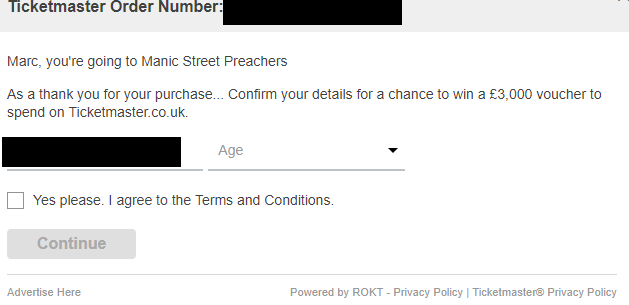
Finally after my payment is confirmed, I am asked to “Confirm my details for a chance to win £3,000 to spend on Ticketmaster. ”
“Confirm my details” ?! This immediately seemed to me like a disingenuous way to get people to part with their personal information. If you’re going to have a competition, then label is clearly as such. Asking someone to “Confirm their details” directly after an order process gives the impression it might be mandatory. It looks like this functionality is from a 3rd party partner called Rokt who boast on their web site they allow their clients to “present internal offers as well as up-sell and cross-sell offers to customers that have just transacted on your site.” – I’m sure there’s a great idea in there somewhere, but it’s not presented very well on Ticketmaster. If you want people to sign up for offers (a valid thing for someone to want to do) then tell them that, don’t ask them to “Confirm their details” and hope they won’t notice -especially when they’ve already opted out of marketing communications on the previous page.

Unfortunately you can’t easily avoid doing business with Ticketmaster, because if you want to see a particular band on a certain day, they’re your only choice. Still, I’m looking forward to the gig.