Google Glasses: Something Microsoft Would Have Done (Ten Years Ago)

Google Glasses reminds me of something Microsoft would have released in the early to mid 00’s. The idea has merit, but it strikes me as not being thought through properly. Think Windows XP Tablet PC Edition, or the Origami.

Yes it’s a cool idea to be able to see a computer screen on a pair of glasses, as well as take video from your personal perspective – but will people really want to a) wear glasses all the time (for this to make sense, you need to wear it every waking hour of the day) b) interact with other people who may or may not be busy using their glasses while you talk to them c) interact with people who may or may not be videoing you while you’re talking to them.

Just as people didn’t want to prod a Desktop PC interface with a stylus, I can’t see these glasses being accepted by the masses in their current form. I think the idea does have merit, and would love to see something less intrusive that somehow manages to overcome these social barriers.

Google adverts for the glasses are an example of your typical “geek trying to make themself look overly extroverted to make up for being a geek” syndrome. How many people go skydiving that often? How many people if they did would wear such an expensive pair of glasses? Most normal people (like me) whose daily routine doesn’t involve jumping out of a plane, walking down a catwalk or juggling with fire will struggle to find a use for such a device.

Still, kudos to Google for putting them out there, just as with the Tablet PC in 2002, someone else might just make it work by 2023. Also I admit I haven’t tried them, so I might yet be converted. Better start saving…
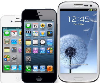
Size doesn’t matter, it’s what you do with it that counts

Apple seems to be getting a lot of bad press recently because of their refusal to release a larger iPhone. That and the fact that iOS is apparently getting 'stale' because hasn't changed much since its release in 2007.
I completely disagree with this criticisms – and here's why: Firstly, when it comes to a phone, I don't believe bigger is better. What matters to me is the portability of the device, coupled with software which is of a high standard and turns this 'black mirror' into something useful. If anything, quality and resolution of the screen matters far more than the dimensions.
When people start talking up screen sizes, it reminds me of the TV market, where people routinely buy the biggest screen they can get for their money, even if it means the screen will disproportionately intrude into their living room. There hasn't been much innovation in TVs in the past 6 years, we've seen half-hearded attempts at 'app' ecosystems, but ultimately people just want to sit passively and watch stuff, not mess about with apps. Since the iPhone was released in 2007, introducing multitouch, inertia scrolling and a touch screen that didn't need a stylus, we haven't seen any other big changes in paradigm. The iPhone 4 got a super high resolution screen that made reading text all the more pleasurable. Apart from that, in terms of hardware at least, we've gotten thinner, lighter and faster and that's all.
With phones, the quality of the apps and ease of use is what makes the difference – not the size of the thing. Price also plays a part – a big part. Having used Android for the past 18 months (HTC Desire S, and a Nexus 7) I can't help but be drawn back to iOS, purely because th software is so much better.


Goodbye HTC Desire S, Hello iPhone

Did you read that right? Yes I posted to this blog in 2010 when I replaced my old iPhone 3GS with HTC’s Desire S. and 2 years before that when I replaced my Nokia N95 with the iPhone.

At the time of getting my Android phone I wasn’t too happy about the state of the iOS ecosystem. Apple was banning apps left right and enter, and the iPhone 4 didn’t excite me much. I took the plunge and switched to Android, and was immediately pleased with what I got. Over time however I came to regret that decision. What I took for granted in iOS was missing from Android – quality.

Quality is a difficult concept to describe. We all know it when we see it, but it isn’t always obvious to see when you’re looking for it. In the case of my HTC Desire S, quality means the small details in the user interface that you would never notice until you have to do without – take for example making a phone call to someone who isn’t available, I’d go to my recent contacts list (3rd in the list), tap their name, and wait while it rings. After 20 seconds it would hit voicemail. This was an urgent call, so I wanted to call back straight away. I hit ‘Hangup’ and went back to the recent call list, thinking to tap the name – still 3rd in the list. Just as I tap it however, it moved from 3rd in the list to 1st, and I end up calling someone else instead. The phone was just slow. It may have been dual-core compared to my single-core iPhone 3GS, but that comparison is like sitting a motorbike and a lorry next to each other with the same engine, and expecting them to hit 60 at the same time.

Then there was the lack of updates – it took a year for me to get Android 4.0 and when I  finally did it was through a HTC developers site (and made the phone even slower).

The on-board software was buggy and confusing. There seemed to be 2 of everything. A HTC Twitter app, the official Twitter app. A HTC mail client, and GMail, HTC Facebook and well, you get it. On the other hand with iOS you get minimalistic software that actually does useful stuff.

It wasn’t all bad of course, as by original blog post stated. You do get a lot more freedom, but I found myself not caring since Apple seems to be far more reasonable these days when it comes to App Store Approval (and I actually quite like the fact that Apps can’t take over system functions so easily).

So, I am glad to be back Smile